Visual AHP Software Tutorial Video
A Visual Guide to AHP Online Software
Working with AHP software is effortless: simply sketch your hierarchical graph, input pairwise comparison data, and review the output report or have it delivered to yout.
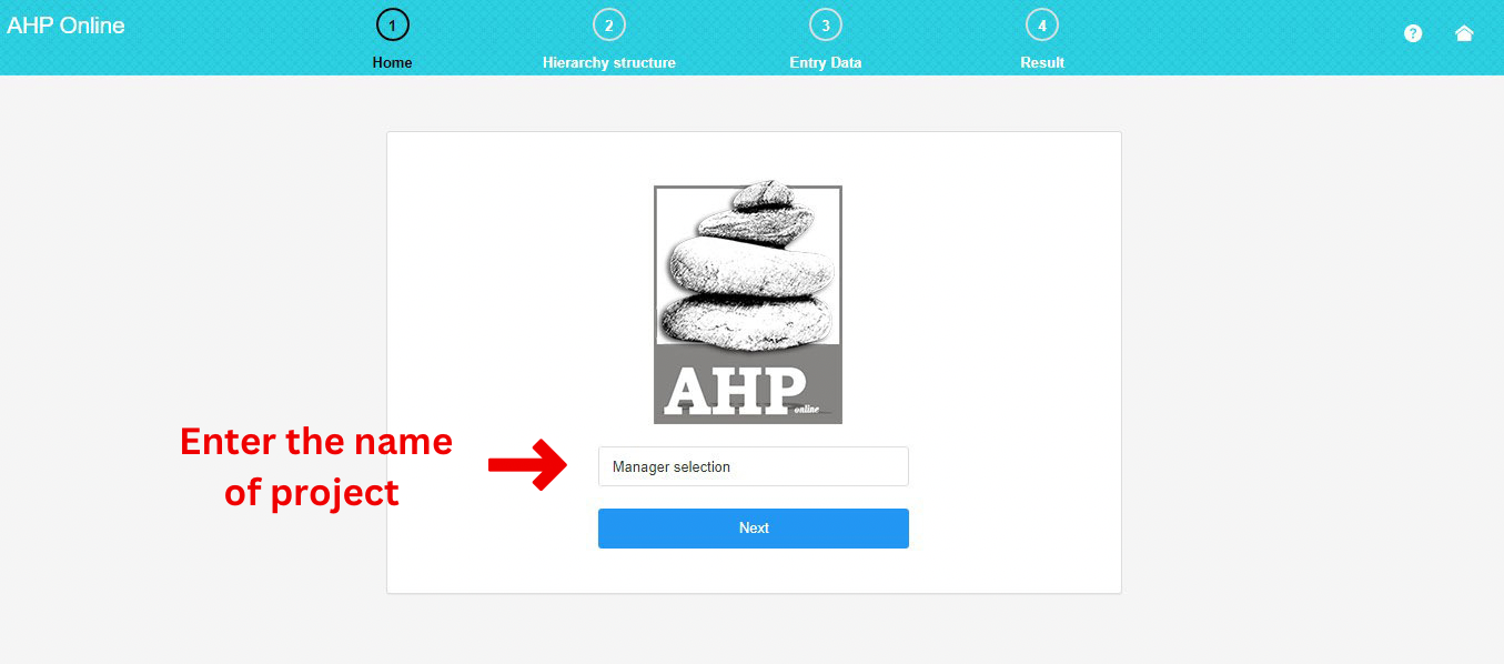
1. Input the Project Name
In the initial step, input the name of your project.
For instance, this project is undertaken based on the manager’s selection and follows the AHP procedure.
2. Draw the Chart
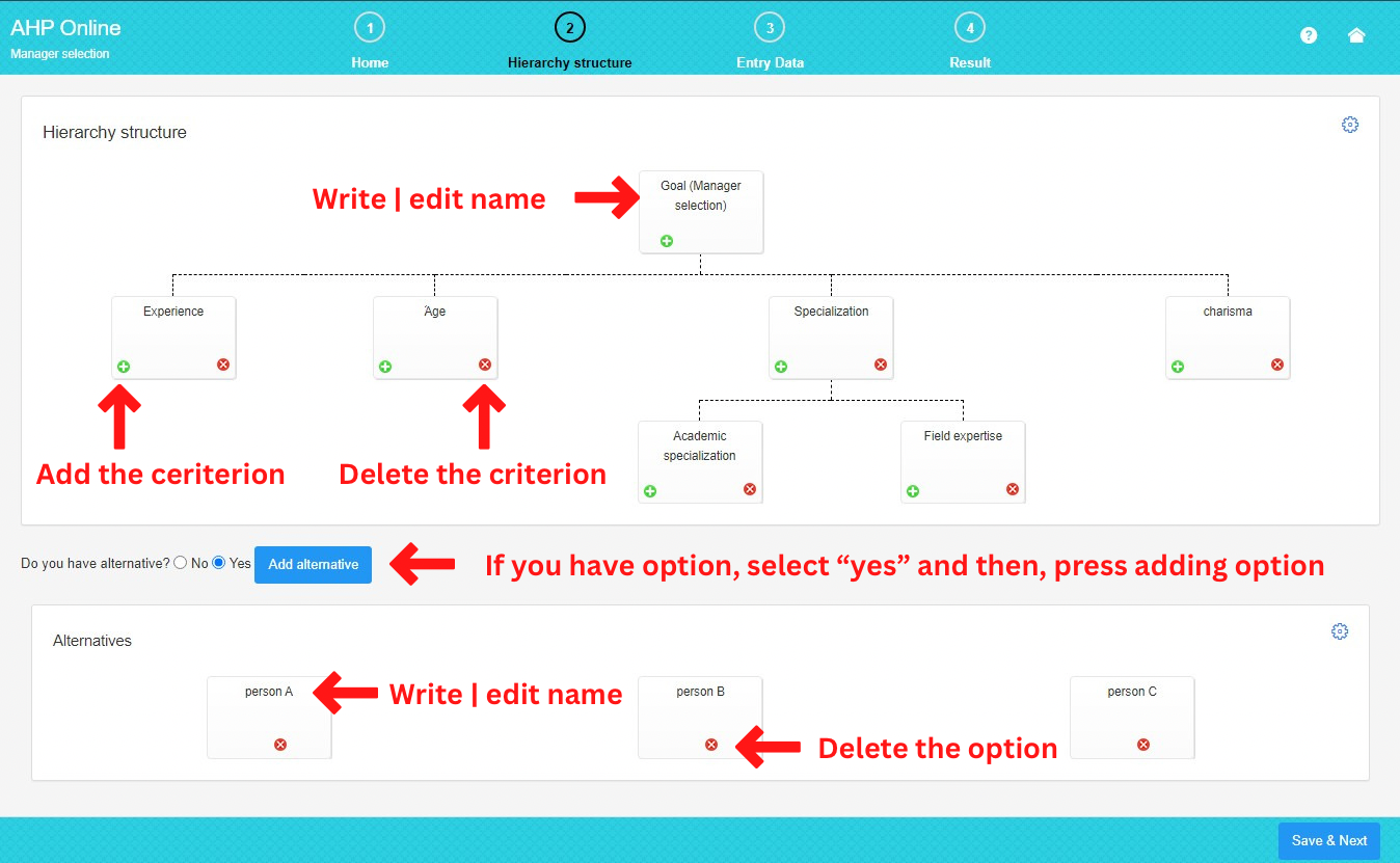
In this part, you can create your hierarchical graph.
To add a criterion or sub-criterion, click the positive button. To delete a criterion (or sub-criterion), use the negative button.
To assign a custom name to a criterion, click on its name and enter your preferred label. We recommend selecting a brief name.
Refer to the image and access the settings section (gear) to customize the appearance of the graph. Here, you can modify the color, shape, and other characteristics of the graph (additional features will be available soon).
If you have alternatives, select “yes,” and then, by pressing the “add alternative” button, include your new alternative. If you don’t have any alternatives, choose “no.
To remove a preferred alternative, click on the negative sign.
The process of renaming and adjusting the appearance of alternatives is similar to the criterion section (these features will be added soon).
3. Input the Pairwise Comparison
In this section, you can finalize the pairwise comparison charts created based on the hierarchical graph.
To input data, click on each table cell and enter your pairwise comparison number.
To save time, it is recommended to enter your data in Excel first and then copy and paste the data for each chart.
When entering a number greater than 1, it indicates the preference of the row criteria over the column criteria. For instance, entering the number 5 means that the criteria in the row are five times more preferable than the column criteria.
If you enter a number between 0 and 1, it signifies the preference of the column criteria over the row criteria. For example, entering the number 0.25 means that the criteria in the column are four times more preferable than the row criteria.
By pressing the inconsistency rate button, the inconsistency rate is displayed above each pairwise comparison chart.
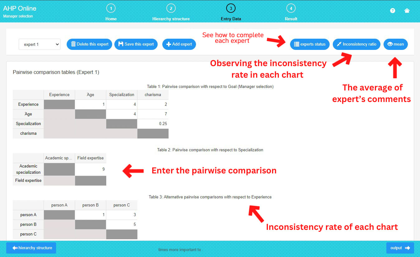
As you can observe in the picture above, the expert’s section comprises:
– Adding Expert: If there is more than one expert, you can increase the number by pressing this button. Upon pressing, the previous expert will be automatically saved, and the new expert will be added.
– Delete: Pressing this button removes the existing expert.
– Save: Pressing this button saves the data of the existing experts.
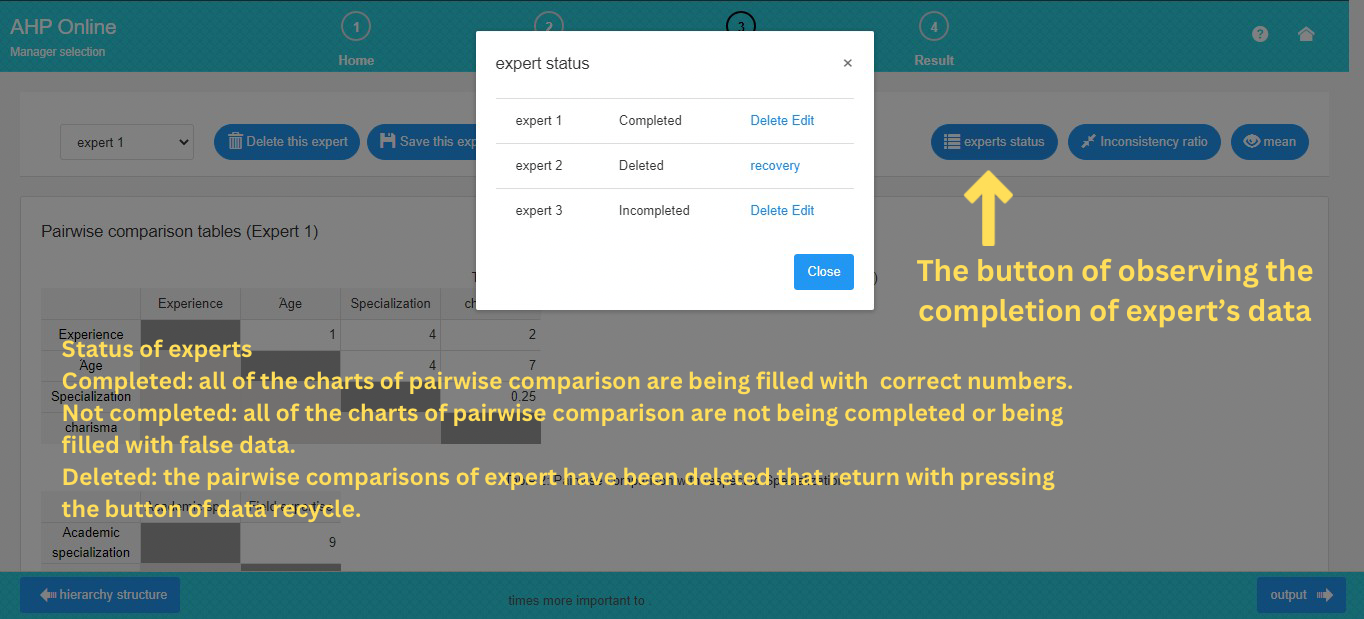
As illustrated below, the expert’s status includes:
– If all of the expert’s data is completed and saved, the expert’s status is marked as completed.
– If not all of the expert’s data is completed, the expert’s status is labeled as not completed.
– If an expert is deleted, the status is set to removed, and you can recover that data in this section.
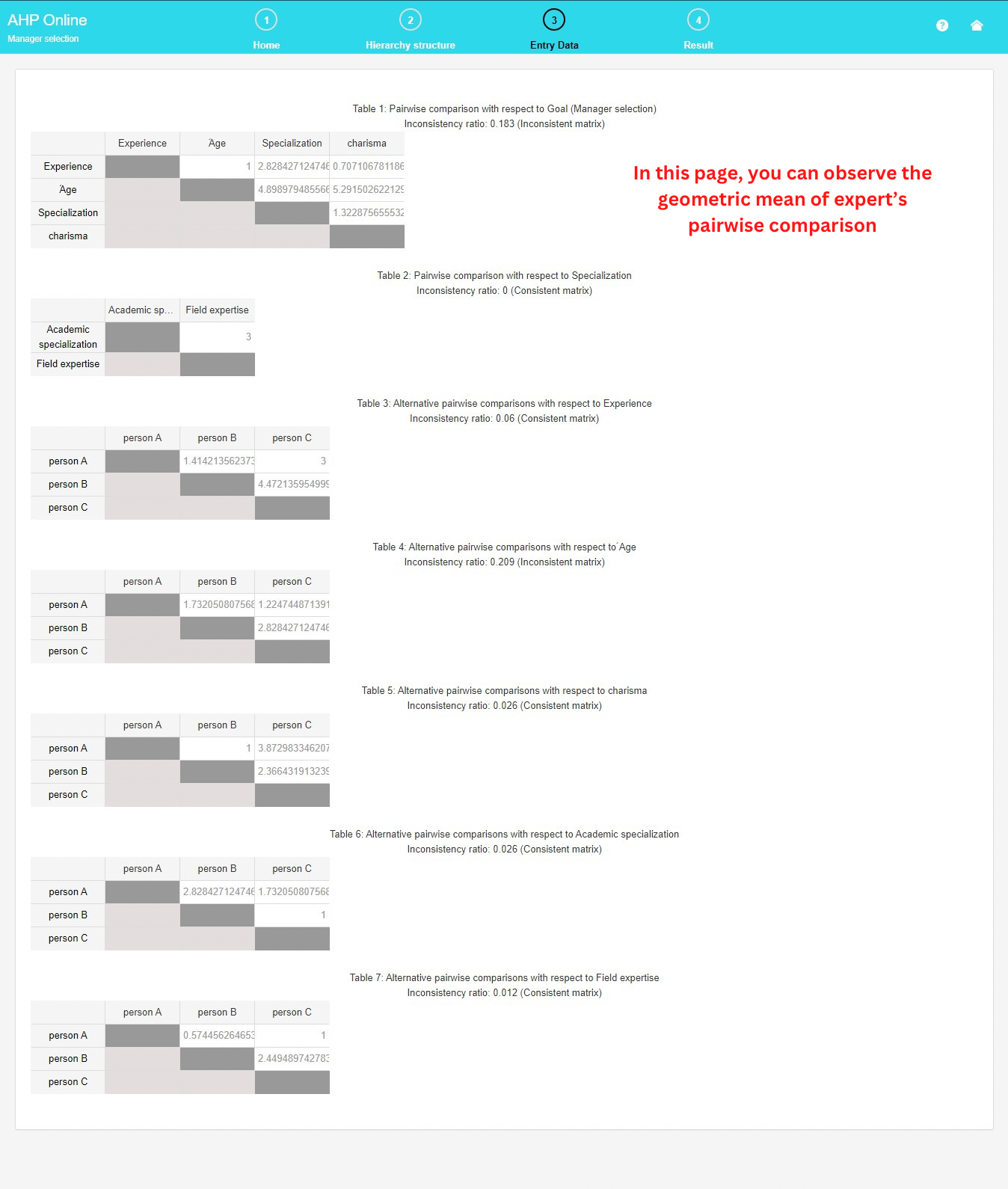
Mean: By pressing this button, the geometric mean of all experts is displayed, along with the inconsistency rate of all pairwise comparison charts.
To observe the mean, ensure that the data for all existing experts is completed.
The pairwise comparison bar exists at the bottom of the pairwise comparison page, indicating the degree of preference for the selected cell:
– If the number is greater than 1, it signifies the degree of preference of the row component over the column component.

In this example, the row factor (charisma) is twice as preferable as the column factor (age).
– If the number is between 0 and 1, it signifies the degree of preference of the column component over the row component.

4. Output Report
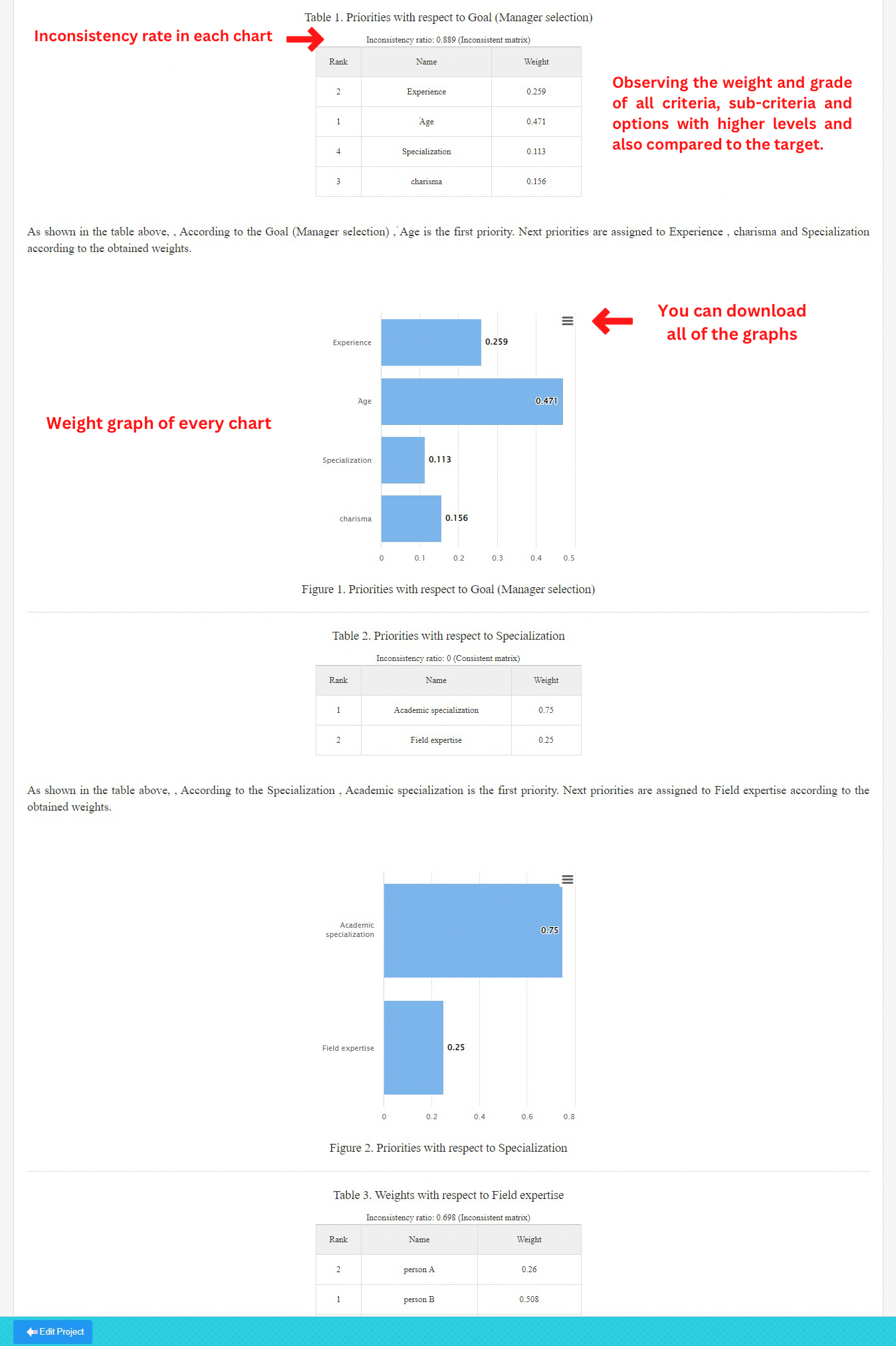
In this section, you can visually assess the weighted criteria, sub-criteria, and alternatives at higher levels through charts and graphs. Each graph is accompanied by a consistency rate displayed on top. Additionally, you have the option to download each graph in various formats.
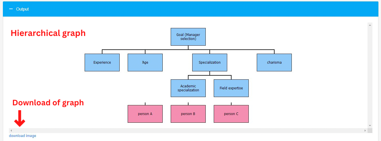
Additionally, you can view and download the hierarchical graph of the research.
In the download section, you have the option to download the output Word report, an Excel file containing input data, and an Excel file displaying output data with inconsistency rates. As depicted in the image below, you can choose between the “ideal” and “distributive” methods for calculating the output weights.

