A Visual Guide to Fuzzy AHP Online Software
The Fuzzy AHP (Chang) Software is user-friendly: (1) Draw the hierarchical chart, (2) Choose/create your customized fuzzy scale, (3) Complete the pairwise comparison matrices, and (4) Obtain the complete output.
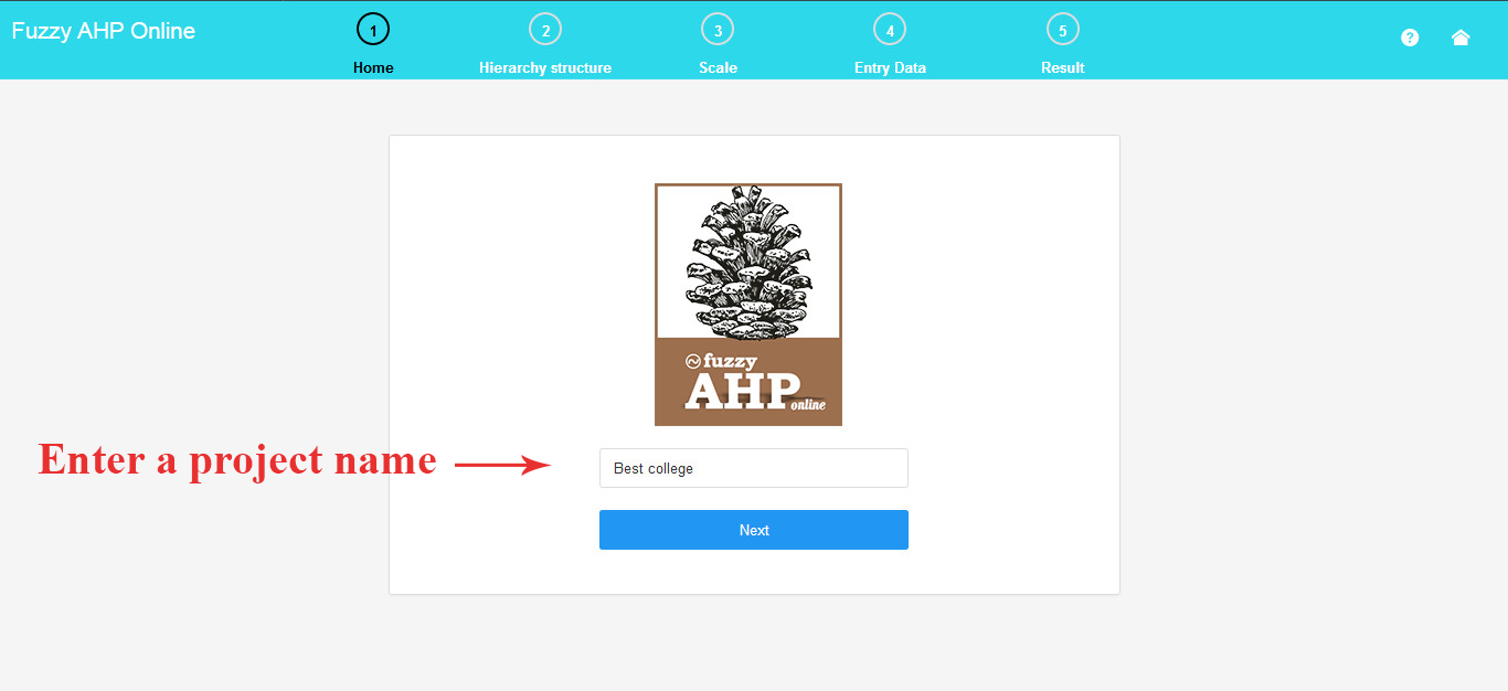
1. Input the Project Name
To begin, input your project’s name.
For instance, in this project, the Fuzzy AHP (Chang) method is employed to determine the optimal school.
.
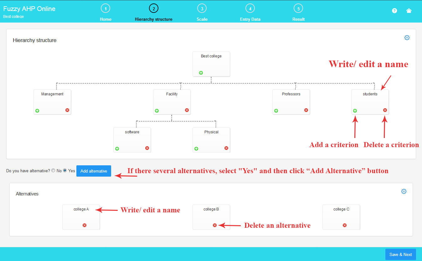
2.Draw a Hierarchical Chart
Here, you can create your hierarchical chart.
To add a criterion or sub-criterion, click the plus (+) symbol. To remove a criterion or sub-criterion, click the minus (-) symbol.
To assign a name to the criterion, click on the criterion name and enter your desired short name.
As illustrated in the image, for chart customization, click the gear icon to adjust color, shape, and other settings (additional features coming soon)
If there are multiple alternatives, choose “Yes” and then click the “Add Alternative” button to introduce a new alternative. For projects without alternatives, select “No”.
To remove a selected alternative, click the minus (-) symbol.
The process for altering the name and appearance of an alternative is the same as for criteria (additional features coming soon).
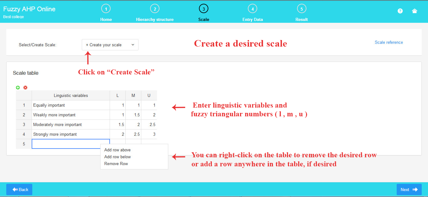
3. Select /Create the Fuzzy Scale
Here, you have the option to choose or customize your own fuzzy scale from a selection of default scales.
Select your preferred default fuzzy scale from the available options in the slider bar.
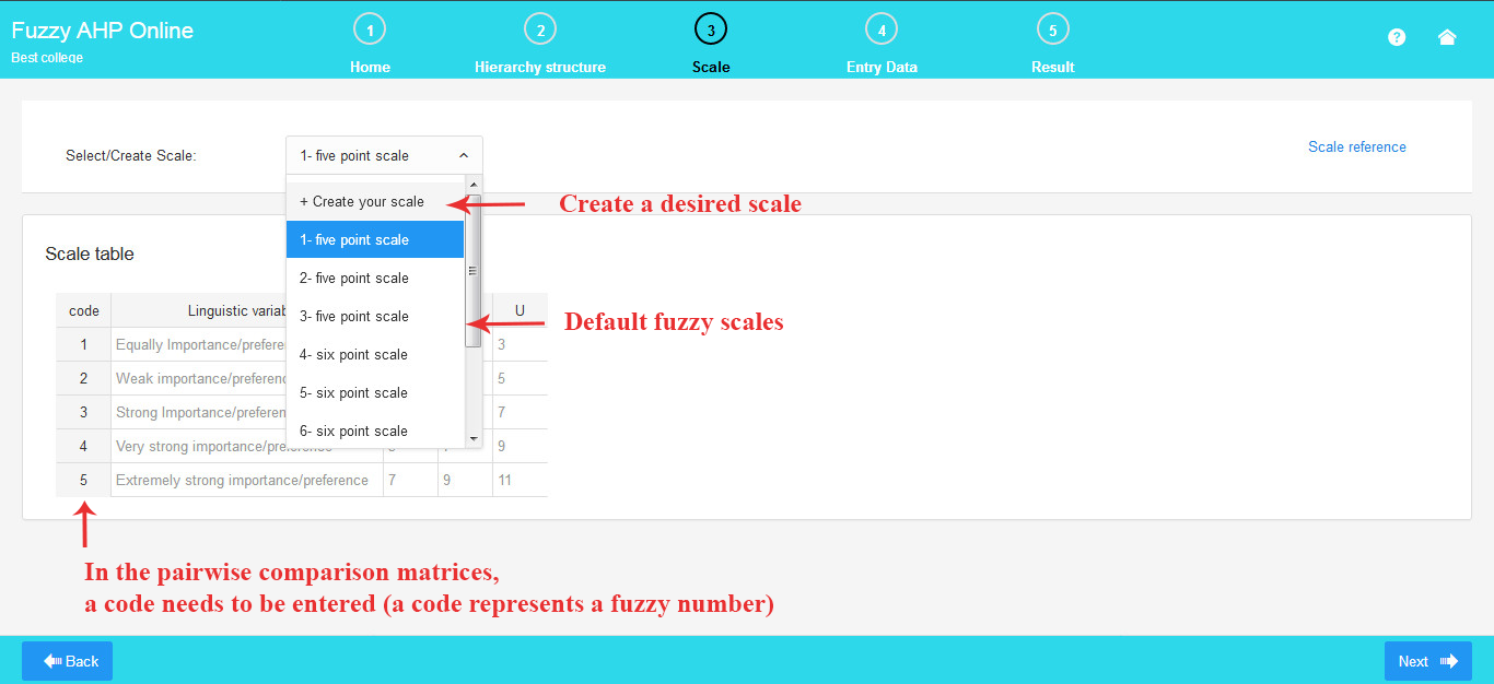
If you prefer to create a custom scale, click on “Create your Scale” and build your own scale using the provided table.
To create a new scale, enter your desired verbal expressions and corresponding fuzzy triangular numbers. A triangular fuzzy number is denoted as (l, m, u), where l and u represent the lower and upper values of the fuzzy numbers, and m stands for the middle value.
As depicted in the image, you can effortlessly edit a scale.
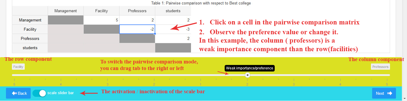
4. Input Pairwise Comparisons
Here, you can complete the pairwise comparison matrices generated based on the hierarchical chart.
Note that in the pairwise comparison matrices, you need to input the codes corresponding to the verbal expressions in the scale table. (A code represents a verbal expression; for instance, code 1 signifies equal importance)
To fill the pairwise comparison tables, simply click into each cell of the matrix and enter your respective pairwise comparison number.
To enhance efficiency, it is recommended to insert codes in Excel to save time. Subsequently, copy and paste the tables from Excel in one go.
If a row criterion is more significant than the column criterion, input a positive number. For example, entering 5 implies that the row criterion is 5 times more important than the column criterion.
Conversely, if a column criterion is more significant than the row criterion, input a negative number. For instance, entering -4 indicates that the column criterion is 4 times more important than the row criterion.
By clicking on the “Inconsistency Ratio” button, the inconsistency ratio will be displayed at the top of each pairwise comparison matrix.
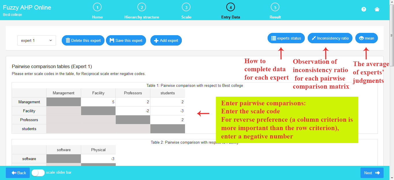
As evident from the image above, the panel for experts includes the following functionalities:
Add Expert: Increase the number of experts by clicking “Add Expert” if there are several experts. This action automatically saves the previous expert’s data and adds a new expert.
Delete Expert: Clicking “Delete Expert” removes the current expert from the list.
Save Expert: Click “Save Expert” to store the data of the current expert.
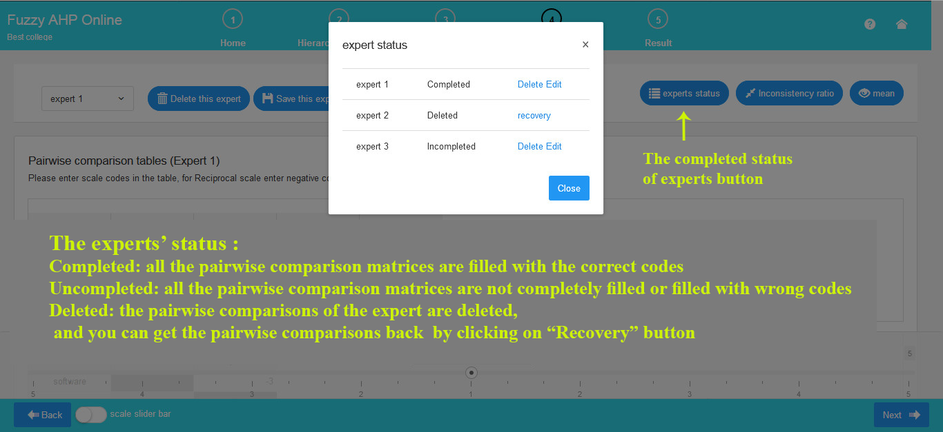
As depicted in the image below, the statuses of experts are as follows:
Completed: If all expert data is filled in and stored.
Incomplete: If some or all expert data is not completed.
Deleted: If an expert has been removed, the status is “Deleted,” and you have the option to retrieve the data.
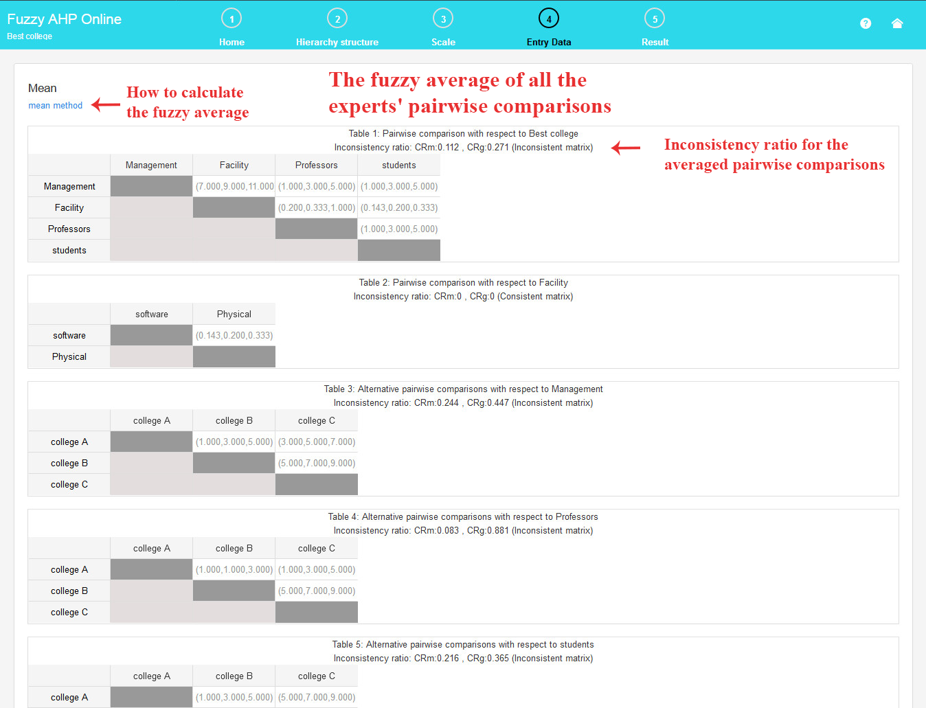
To calculate the mean, click on the “mean” button. This will display the fuzzy average of all experts’ judgments, along with the inconsistency ratio for all pairwise comparison matrices. (Refer to the existing page for details on how to calculate the mean through a provided link)
It’s important to note that to observe the average, the data for all current experts must be completed.
There is a scale bar at the bottom of the screen, indicating the preference value of the selected cell. You can adjust the pairwise comparison number using the scale bar tab.
When the entered number is positive, it signifies a preference for the row component over the column component.
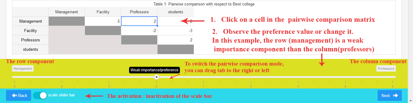
If the entered number is negative, it indicates a preference for the column component over the row component.
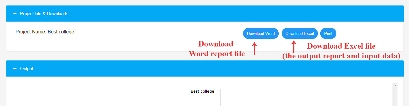
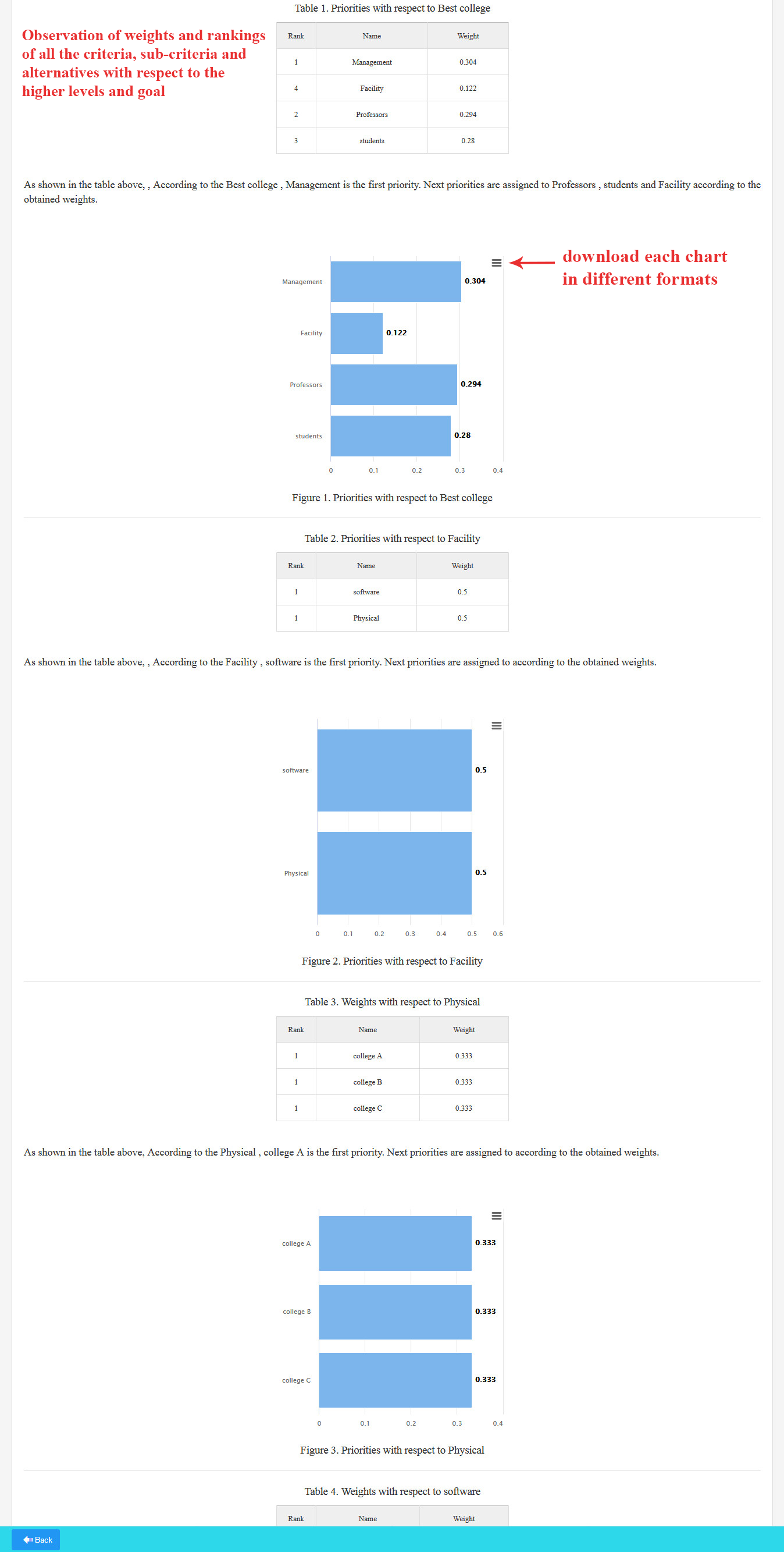
5. Output Report
Here, you can view the weights of all criteria, sub-criteria, and alternatives concerning the higher levels and the overall goal, presented in both table and chart formats. Additionally, you have the option to download each chart in various formats.
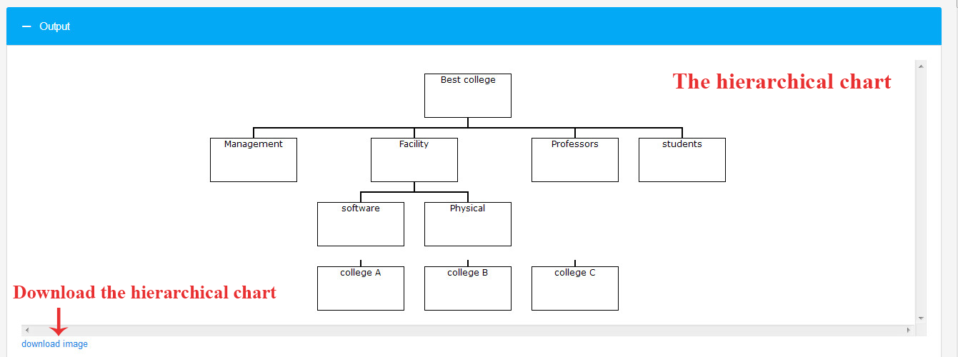
You can also view the hierarchical chart of the research and download it.
You can download an Excel file containing all pairwise comparisons, inconsistency rates, and output weights.